Back to school store survey
Alan
2021
The data that we had was about a survey they did for a back-to-school promotion.
The survey results where summarized and classified into 2: Our stores and all stores.
We created the following graph with the information provided.
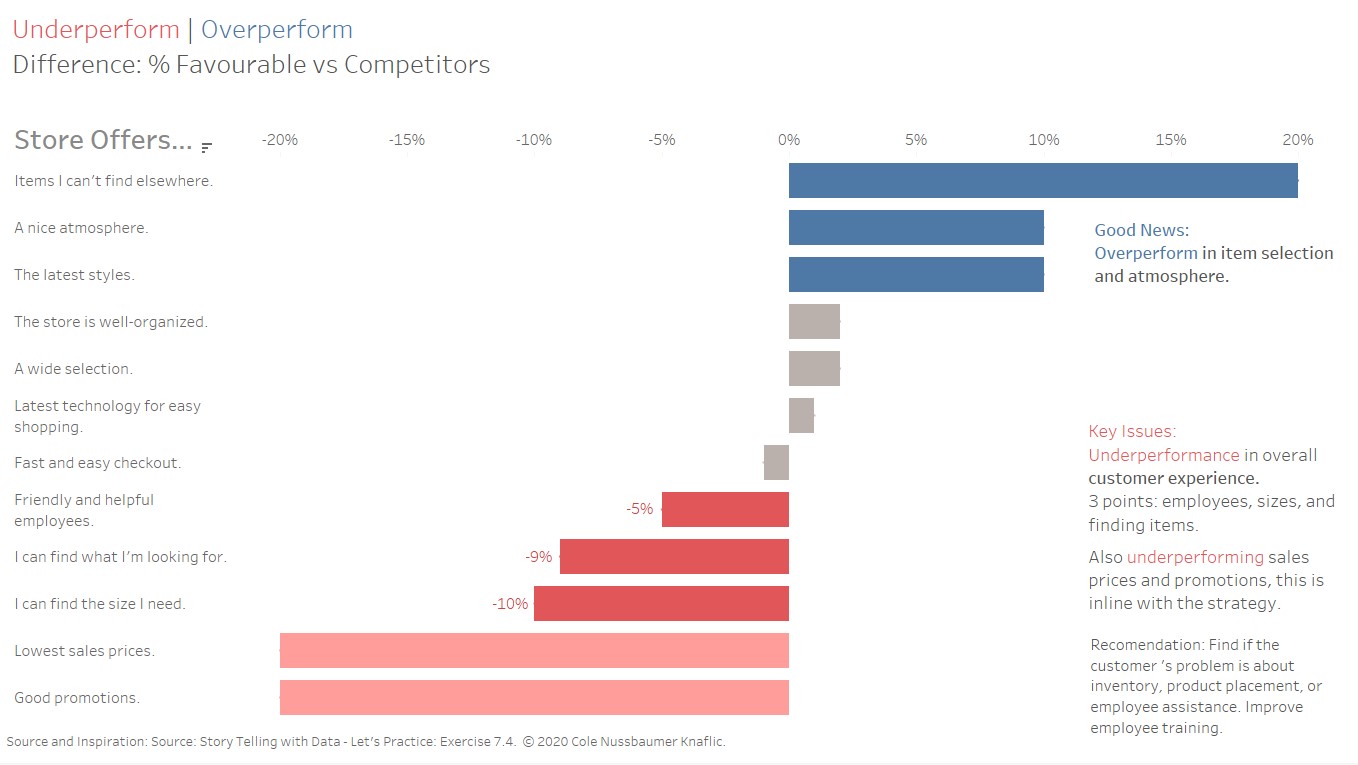
The graph we preferred was a bar graph with the difference between our store and our competitors. A positive score means that we are doing better than the competitors and a negative score means that we are doing worse.
We added some insights and recommendations to the graph. And opted in colors that highlight the good, the key issues and the bad.